Patterns / Auth
Split-panel. Brand on the left.
The auth shell is a 50/50 split with the brand panel on the left (animated waves, phone mockup, brand mark) and the form panel on the right. Login, register, forgot-password are all standalone pages, never modals: bookmarkable, no mobile scroll-in-scroll, native back button.
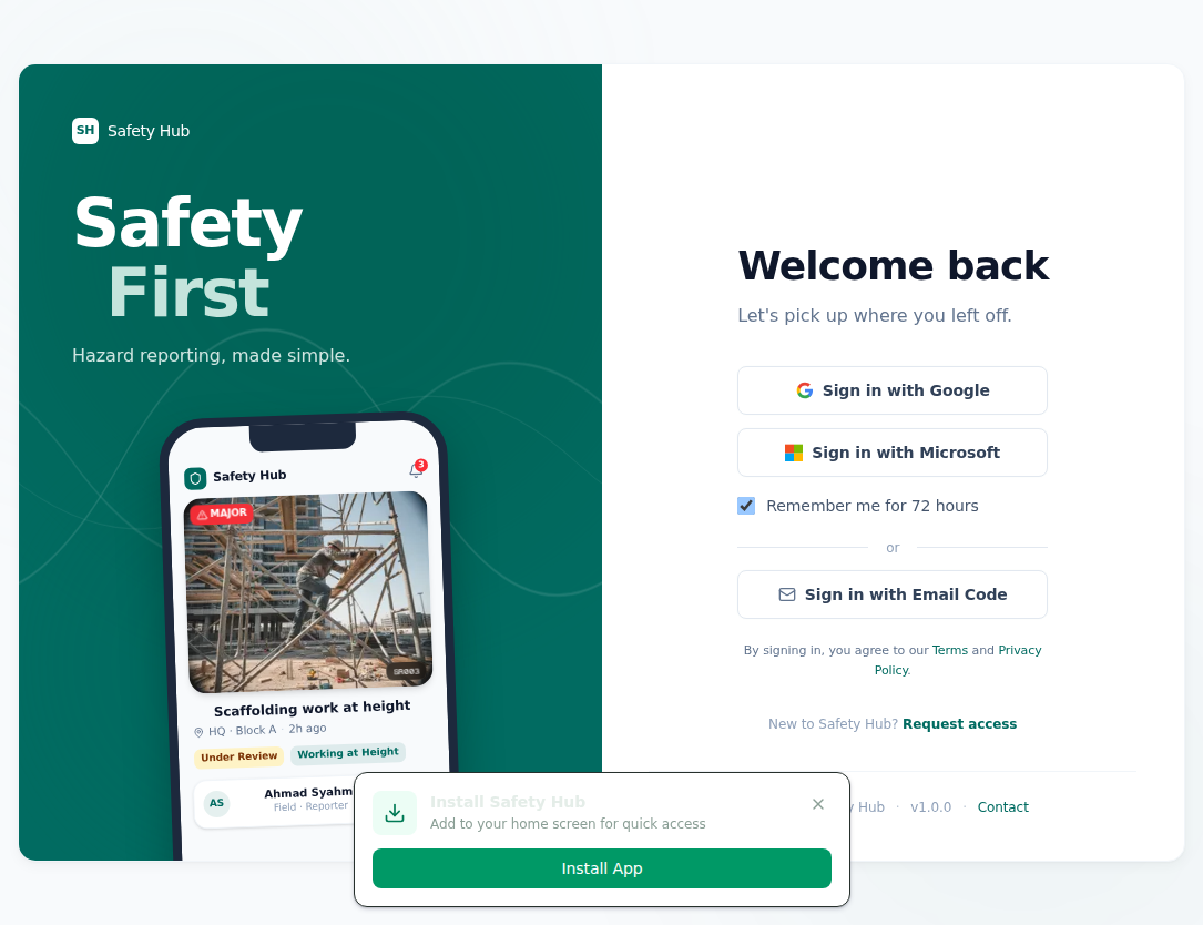
The brand panel breathes. It is never busy. The phone mockup hints at the product context — a real report card from the app — without the reviewer needing to know what the app does. The form panel stays clinically minimal: three sign-in methods, one persistent "remember me" toggle, one secondary "request access" link.
Register and forgot-password are standalone pages, never modals. Bookmarkable. No mobile scroll-in-scroll. Native back button works.
Reuse
The same layout drops into any operator-facing app — copy the auth components folder, swap one config file (brand tokens, app name, OAuth provider URL), and the new app inherits the shell.